The Scandinavian palette is a unique and beautiful set of colors that have been much celebrated in recent years. Commonly used in interior design, fashion, and graphic design, the colors reflect the natural environment and the changing seasons. The palette is a combination of muted, earthy tones and bright, bold shades that can evoke a sense of calm and tranquility or energy and vibrancy. In this article, we will explore the origins and characteristics of the Scandinavian palette and how it can be used in design to create beautiful, harmonious spaces.
The Origins of the Scandinavian Palette
The Scandinavian palette is rooted in the natural environment of Norway, Sweden, Finland, Denmark, and Iceland. The harsh climate, long winters, and short summers have influenced the colors used in traditional Nordic design. Historically, Scandinavians used natural pigments, such as lichen, berries, and bark, to create dyes for textiles and paint for interiors. This led to a palette that was muted and earthy, with shades of green, brown, and gray dominating.
In the mid-20th century, Scandinavian designers began to incorporate brighter colors into their work. This was partly due to the development of synthetic pigments and the influence of modern design movements such as Bauhaus and Art Deco. The brighter colors added energy and playfulness to traditional Nordic design and helped to create a unique, recognizable aesthetic.
The Characteristics of the Scandinavian Palette
The Scandinavian palette is a combination of warm and cool tones, muted neutrals, and bold, bright hues. The colors are inspired by the natural environment and reflect the changing seasons. Some of the key characteristics of the Scandinavian palette include:
Muted Neutrals
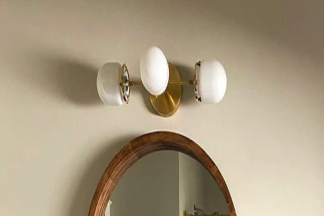
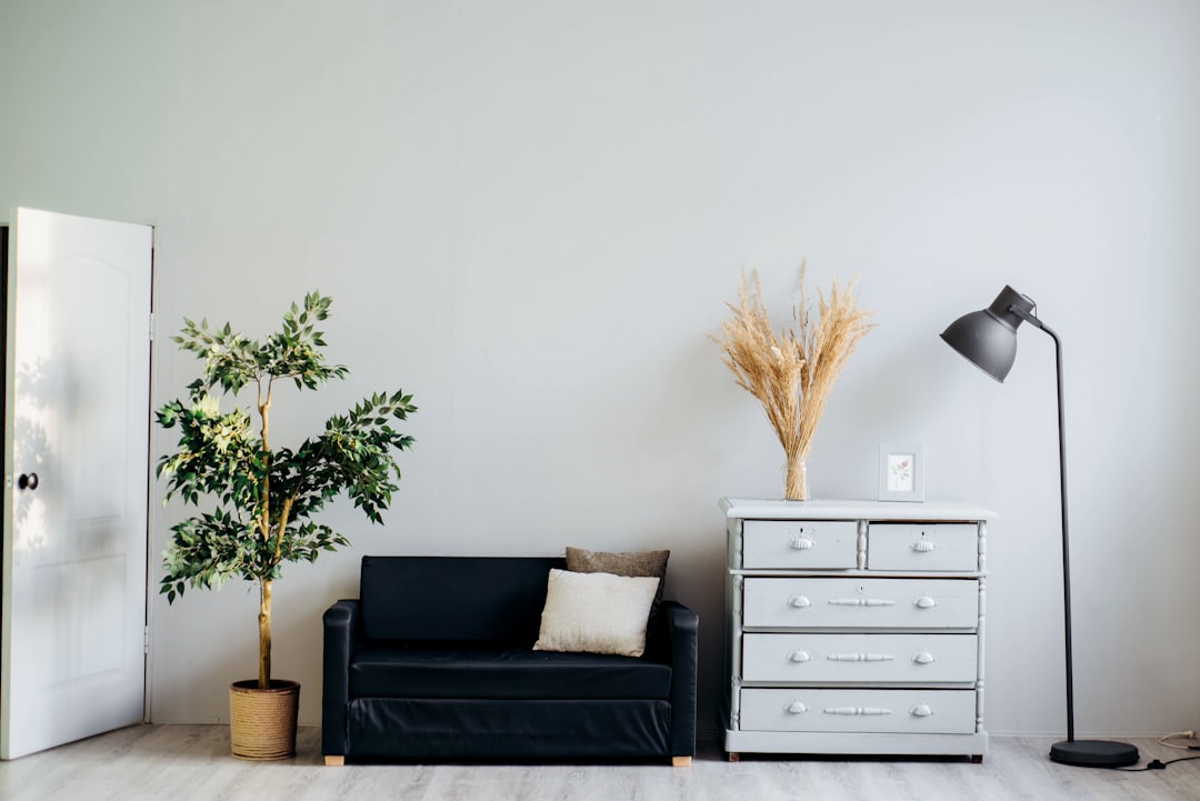
Neutral shades such as white, gray, and beige are prevalent in the Scandinavian palette. These colors provide a calm, neutral backdrop for bolder, brighter hues.
Earthy Tones
Earthy, natural hues such as forest green, rust, and burnt orange are also common in the Scandinavian palette. These colors reflect the natural materials and landscapes of the region and add warmth and depth to interiors and fashion.
Bold Accents
Bright, bold accents such as vibrant red, navy blue, or mustard yellow are used to add energy and vibrancy to the palette. These colors are often inspired by the traditional costumes and folk art of the region and can be used to create striking contrasts within a design.
Using the Scandinavian Palette in Design
The Scandinavian palette can be used in a variety of design contexts, from fashion and textiles to interiors and graphic design. The key to using the palette effectively is to balance the warm and cool tones, neutrals and accents, and natural and synthetic pigments.
In interiors, the Scandinavian palette can be used to create serene, harmonious spaces that reflect the natural environment. Neutral walls and floors can be paired with earthy or bold accents, such as a vibrant patterned rug or a bright yellow armchair. Natural materials such as wood, wool, and leather can add warmth and texture to a room while maintaining a cohesive color scheme.
In fashion and textiles, the Scandinavian palette can be used to create timeless, functional pieces that reflect the natural landscape. Muted neutrals and earthy tones can be used to create classic, minimalist designs, while bold accents can add a pop of color and energy to a piece. The palette can be used to create a sense of connection to nature and a celebration of traditional Nordic craftsmanship.